Why Navy Blue Continues to Define Timeless Luxury Interiors
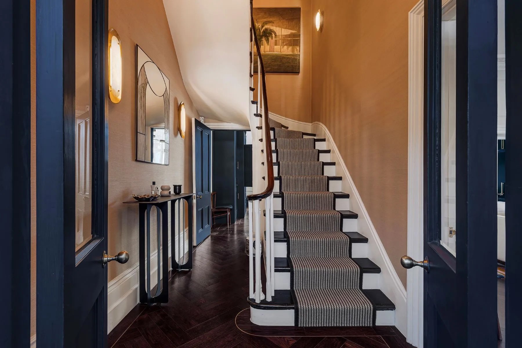
Notting Hill, London | United Kingdom Sotheby’s International Realty
Some homes immediately capture your attention, while others barely register. Often, the difference comes down to thoughtful design choices—including the colors used throughout the property.
From the earthy appeal of terracotta to the cheerful personality of yellow and the romantic character of lilac, color can fundamentally influence how a home feels.
One color in luxury design is navy blue—a shade that has remained a favorite for generations thanks to its ability to feel both traditional and contemporary.
“Navy is elegant, versatile and timeless,” says London-based interior designer Sarah Brown. The shade has particularly strong ties to classic British interiors, appearing everywhere from painted cabinetry and libraries to Victorian residences.
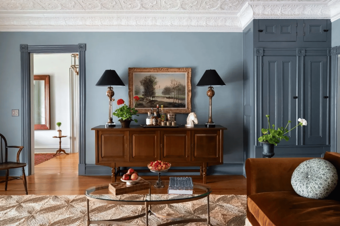
Hudson Valley, New York | Four Seasons Sotheby’s International Realty
The History Behind Navy Blue
Navy's story is closely connected to its namesake: the British Royal Navy.
According to Joa Studholme, color curator for British paint company Farrow & Ball, the name comes from the fabric traditionally used for officers' uniforms after the navy began sourcing indigo pigment from India.
One historic setting demonstrates just how effectively the color can complement sophisticated surroundings. At The Wallace Collection, a historic museum house in London, navy walls help emphasize the intricate details and richness of its ornate, framed artwork.
The effect is a reminder that dark blue doesn't necessarily compete with decorative elements. Used thoughtfully, it can provide the perfect backdrop for them.
Why Navy Works So Well in Luxury Design
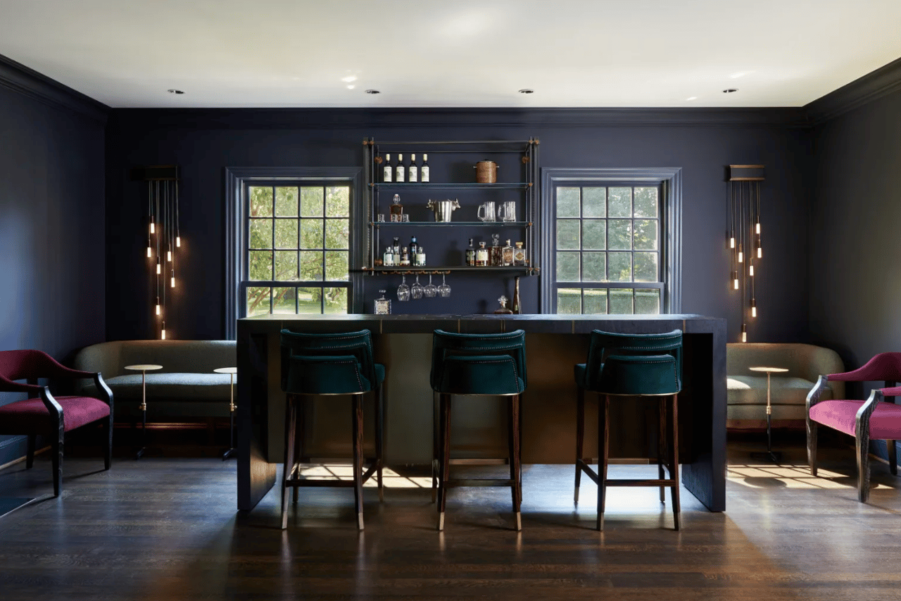
Navy's staying power comes partly from its versatility. Unlike some darker colors that can make a room feel heavy, navy can introduce depth while maintaining a sense of energy.
Brown recommends pairing it with warm neutrals, pinks and even unexpected shades of green. The key, she says, is balance—particularly through contrast, texture and generous natural light.
That flexibility allows navy to take on very different personalities depending on how and where it is used.
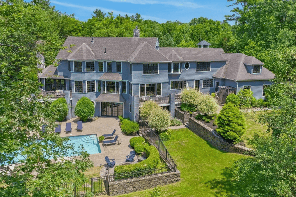
Cape Elizabeth, Maine | Legacy Properties Sotheby’s International Realty
A Navy Exterior That Belongs in the Landscape
A sprawling estate in Cape Elizabeth, Maine demonstrates how confidently navy can be used outdoors.
Its gray-toned navy exterior complements the property's lush green surroundings rather than competing with them.
Studholme describes the color choice as particularly bold, but says it ultimately allows the residence to feel naturally connected to its setting. The blue and surrounding greenery work together to make the home appear as though it has always belonged within the landscape.
This is one of navy's greatest strengths: it can make a statement without necessarily overpowering its surroundings.
Creating Continuity in a Historic London Home
In London's Notting Hill, a carefully restored Victorian residence takes a different approach.
Here, navy reinforces the home's historic architecture while helping visually connect its individual rooms.
High-gloss blue appears across the residence as a continuous design element, extending beyond the walls to joinery, door trims and built-in features.
The result demonstrates how one strong color can create cohesion throughout a large home without requiring every room to look identical.
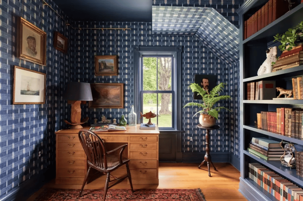
Hudson Valley, New York | Four Seasons Sotheby’s International Realty
Making a Navy Home Office Feel Warm and Inviting
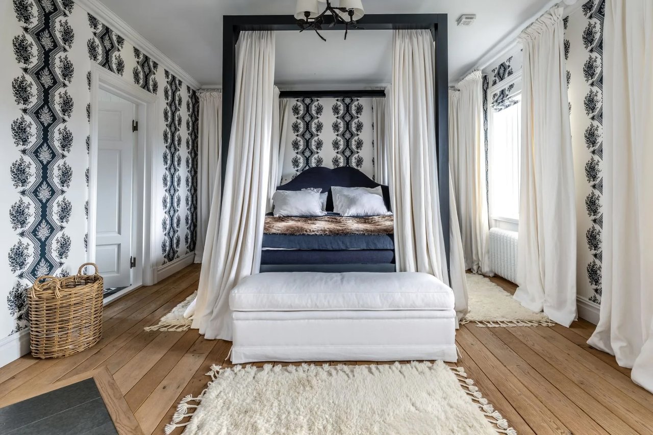
At Ulster Landing, an early-19th-century estate in New York's Hudson Valley, navy takes on a particularly cozy role.
A home office wrapped in patterned navy wallpaper feels intimate and welcoming. Studholme attributes much of that effect to extending the dark blue across both the trim and ceiling.
Using white on either surface, she suggests, would have disrupted the intended atmosphere.
Elsewhere in the residence, navy cabinetry and doorframes provide contrast against lighter blue walls, demonstrating another approach to layering different intensities of the same color family.
Navy Blue in a Scandinavian Mountain Retreat
Navy also proves remarkably adaptable in a striking mountain estate in Sweden, located along historic County Road 322.
The property includes buildings dating back to the 18th century, yet navy has been incorporated into its updated interiors in several contemporary ways.
The most prominent application appears in the expansive, largely open kitchen, where navy cabinetry creates a strong focal point. The color also appears throughout living spaces in patterned wallpaper, soft furnishings, bedding and bathroom tile.
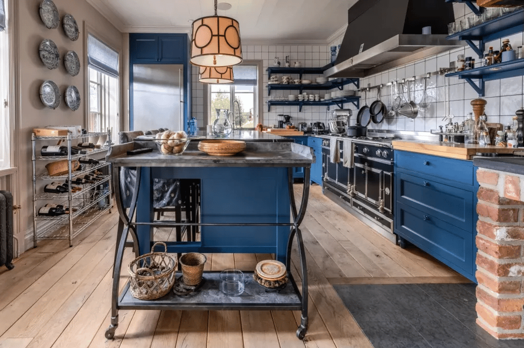
Jämtland, Sweden | Sweden Sotheby’s International Realty
In the kitchen, Brown explains that navy establishes a strong visual anchor while allowing other elements of the room to remain prominent.
Studholme particularly appreciates the cabinetry treatment because most of the blue sits below eye level, preventing the darker shade from dominating the space. The navy also works naturally with the raw wood flooring, creating a harmonious relationship between the warmth of the wood, the walls and the exposed brick.
The Timeless Appeal of Navy
From historic British interiors to Victorian London residences, Hudson Valley estates and Scandinavian mountain homes, navy demonstrates just how versatile a color can be.
It can feel classic or contemporary, dramatic or understated, warm or sophisticated—depending on the surrounding architecture, materials, lighting and complementary colors.
For homeowners considering a more distinctive design palette, navy offers a particularly enduring alternative to neutral interiors. Whether introduced through cabinetry, walls, doors, furnishings or even an exterior façade, the shade can add depth and personality while remaining remarkably timeless.
Considering a More Distinctive Home?
The right home is about more than square footage or location—it is also about the architecture, character and design details that make a property feel uniquely yours.
If you're considering buying or selling a distinctive home in Manhattan Beach or throughout the South Bay, contact me. I'd be happy to help you explore properties that fit your lifestyle, aesthetic and long-term goals.